LightAdept wrote:If needed, feel free to make it bigger, remember, make it any size needed, we can scale it down when its done.
Yeaaah I knew that before making this model, but for some reason I decided to make things harder on myself.
BamfkingJDM wrote:Looks great, I think you really gave him a bad flat top hair cut however. Which imo makes him look a bit too serious, I always felt machop was a bit light-hearted. Also agree about the lips as well.
Might need to fix the face as well. (Hope this helps the frustration, I've always found projects easier to do when I have a laugh or take break)
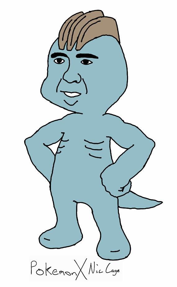
Ugh of course, how could I have messed up such a perfect face! Those eyebrows just scream, "CATCH ME." Haha thanks I did need a good laugh. As for the flat hair cut, yeah I would prefer to do transparent planes so I could make those ridges more curvy. But then they're practically invisible from the front.
Vikerus wrote:The way you shaded him it seems like he just got out of a cave XD
Like karry said the texture is just a little too "dirty" and the lip looks just a tad derpy.
But I do notice that his upper arm is positioned funny in relation to his shoulder and elbow. It just looks really odd. Almost like he would have bingo wings in a couple of years lol. Also the hands are a bit big or something. They need some revising.
Well Machop does have a history of showing up in caves. XD I don't see where Karrybird said that, but I'll smooth out some of the shading. The hands likely seem big because of the finger size, so I'll edit them.
Sundial_MC wrote:Edeodin, I really must say, you're a wonderful texturer. That eye seriously is the most beautiful eye I've seen ever so far.
Thank you! At least something on the head turned out good. XD
The fingers could use one adjustment that I can be certain about and that is where the fingers come out of the hand. If there is enough room for it. Try rotating the block that starts each finger so it looks more like it is flush with the back of the hand and not popping out from it. So it would come at an incline out from the palm. This would help make them less blockish and odd.
Website: http://www.justiscrafts.com/
Vikerus wrote:I was referring to karry's comment on the skin needing to be more "pretty" then you have made it. I just like to paraphrase.
The fingers could use one adjustment that I can be certain about and that is where the fingers come out of the hand. If there is enough room for it. Try rotating the block that starts each finger so it looks more like it is flush with the back of the hand and not popping out from it. So it would come at an incline out from the palm. This would help make them less blockish and odd.
She said his body looked "pretty skinny", not that his skin wasn't pretty. XD I'm going to try toning down the shading in some parts. I wanted to try indicating the shape of the muscles like I did with Machoke, but it might be too much in this case.
I make Sig Banners, take a look. ^^ http://www.pixelmonmod.com/forum/viewtopic.php?f=9&t=3064
Edeodin wrote:Vikerus wrote:I was referring to karry's comment on the skin needing to be more "pretty" then you have made it. I just like to paraphrase.
The fingers could use one adjustment that I can be certain about and that is where the fingers come out of the hand. If there is enough room for it. Try rotating the block that starts each finger so it looks more like it is flush with the back of the hand and not popping out from it. So it would come at an incline out from the palm. This would help make them less blockish and odd.
She said his body looked "pretty skinny", not that his skin wasn't pretty. XD I'm going to try toning down the shading in some parts. I wanted to try indicating the shape of the muscles like I did with Machoke, but it might be too much in this case.
haha My mistake. Still nice work on this model.
Website: http://www.justiscrafts.com/