NodeCraft

- 18 Jun 2013 21:32
#47024
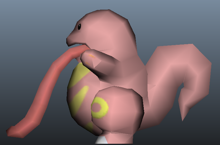
nice! this is definitely one of the better lickitungs i've seen. colors are near perfect, it's just the right size, but a few things do bother me a little.
you see in the side view where the inside of the mouth looks like it's protruding from it's face? it looks good from the front, but you really need to color the sides of that block the same pink as the face. the color of it could also be a bit duller, it contrasts with the pink a bit too harshly.
and with the tail, towards the base it slopes upwards way to drastically, try curving it out more by just a bit and i'd say it's ready for approval!
~stop this train, i wanna get off and go home again. i can't take the speed it's moving in, i know i can't, but honestly, won't someone stop this train.~